In an era where architecture is no longer defined solely by form, but by intelligence, systems, and evolving technologies, the emergence of new educational models is inevitable. PAACADEMY was founded at precisely this intersection, where design meets computation, and where architects are no longer just creators of space, but orchestrators of data, tools, and emerging workflows.
The academy was born out of a clear realization: traditional architectural education was not evolving at the pace of the industry. While practices were rapidly adopting artificial intelligence, parametric systems, digital fabrication, and immersive technologies, many architects found themselves navigating this transformation alone, without structured guidance.
PAACADEMY set out to change that.
More than a platform, it positions itself as an infrastructure for learning, one that equips architects and designers with the tools, logic, and mindset required to operate in a technologically augmented future. Its mission is direct yet ambitious: to educate a new generation capable of shaping a smarter built environment.
A Logo as a System
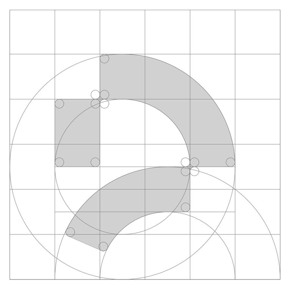
The identity of PAACADEMY reflects this philosophy through abstraction rather than literal representation. At first glance, the mark reads as a fragmented “P” a nod to Parametric Architecture. But on closer inspection, it reveals something more layered: a system of geometric segments, carefully composed yet intentionally incomplete.
The form suggests motion. It does not sit still, it unfolds.
Each segment can be understood as a module: a piece of a larger workflow, much like the fragmented yet interconnected nature of contemporary design processes. Parametric logic, scripting, AI pipelines, and fabrication chains rarely exist as singular, linear actions; instead, they operate as distributed systems. The logo embodies this condition.
The negative spaces are as important as the solid forms. They imply openness, room for interpretation, growth, and continuous learning. In this sense, the identity resists closure. It is not a fixed symbol, but a living one.

The Color of Urgency
The vibrant green background is not subtle. It is intentionally electric, signaling energy, emergence, and forward momentum. In a field often dominated by neutral palettes and restrained aesthetics, this chromatic decision positions PAACADEMY as something different: active, evolving, and unapologetically future-facing.
Green, historically associated with growth, is here recontextualized as technological vitality. It reflects not nature in its traditional sense, but a new ecology, one shaped by algorithms, data flows, and hybrid design environments.
Between Discipline and Disruption
What makes PAACADEMY distinct is not just its content, but its stance. It does not reject architecture’s past; rather, it reframes it through the lens of contemporary tools. The logo mirrors this balance. Its geometry is disciplined—clean, controlled, architectural. Yet its composition is disruptive, offset, dynamic, and slightly unexpected.
This tension is intentional.
It reflects the condition of today’s architect: grounded in spatial thinking, yet increasingly defined by computational fluency.

A Platform, Not Just a School
Ultimately, the PAACADEMY identity is less about branding and more about positioning. It signals a shift from static knowledge to evolving systems of learning. From isolated expertise to interconnected workflows. From traditional authorship to collaborative intelligence between human and machine.
The logo does not try to explain this transformation directly. Instead, it hints at it, through fragmentation, motion, and structure.
Like the discipline it represents, it is unfinished by design.
And that may be its most powerful statement.
Reviews
Excellent
Excellent
No reviews yet. Be the first!

.jpg)

.jpg2.jpg)